Some pretty bad figures
Modified from Top ten worst graphs
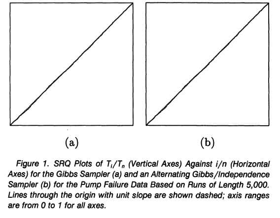
Mykland P, Tierney L, Yu B (1995) Regeneration in Markov chain samplers. Journal of the American Statistical Association 90:233-241, Figure 1
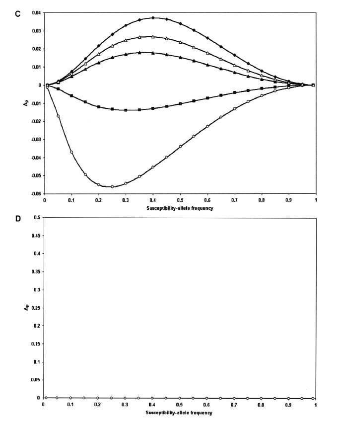
Wittke-Thompson JK, Pluzhnikov A, Cox NJ (2005) Rational inferences about departures from Hardy-Weinberg equilibrium. American Journal of Human Genetics 76:967-986, Figure 1
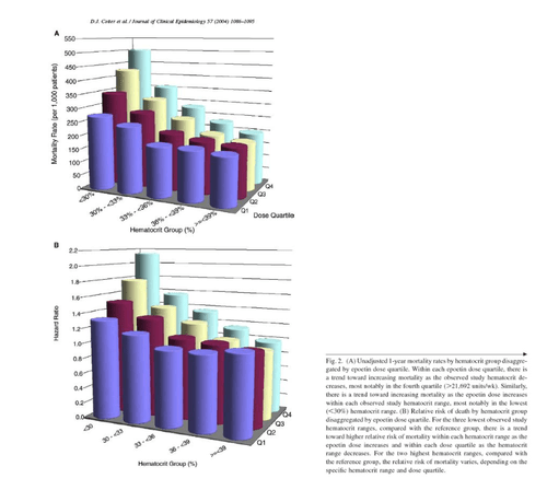
Cotter DJ, et al. (2004) Hematocrit was not validated as a surrogate endpoint for survival among epoetin-treated hemodialysis patients. Journal of Clinical Epidemiology 57:1086-1095, Figure 2
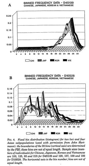
Roeder K (1994) DNA fingerprinting: A review of the controversy (with discussion). Statistical Science 9:222-278, Figure 4
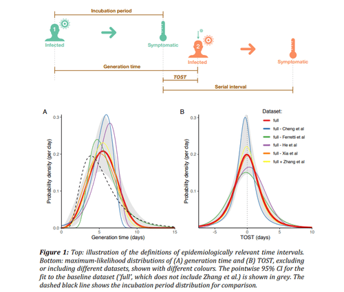
Ferretti et al. (2020) Timing of COVID-19 transmission. medRxiv 2020.09.04.20188516, Figure 1
TOST = Time from onset of symptoms to transmission
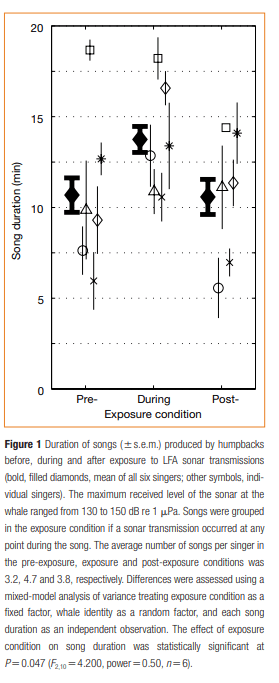
Miller et al. (2000) Whale songs lengthen in response to sonar. Nature 405:903, Figure 1
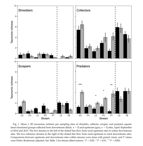
Lundquist and Zhu (2018) Aquatic insect functional diversity and nutrient content in urban streams in a medium-sized city. Ecosphere 9(5):e02284, Figure 1
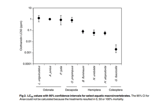
Miles et al. (2017) Effects of clothianidin on aquatic communities: Evaluating the impacts of lethal and sublethal exposure to neonicotinoids. PloS one 12(3):e0174171, Figure 2