Principal component analysis (PCA)

Principal Component Analysis (PCA) is a statistical technique used to reduce the dimensionality of a data set while retaining as much of the variation in the data as possible. It does this by finding a new set of uncorrelated variables, called principal components, which can be used to represent the original data.

To perform PCA in R, the first step is to load the data and scale it if necessary. Next, the prcomp() function can be used to perform the analysis, which returns an object containing the principal component scores and loadings. The summary() function can be used to view the results, and the biplot() function can be used to create a graphical representation of the data in the new principal component space.

Here is an example of performing PCA in R:

# Running a principal components analysis (PCA) in R
# Load data
data(iris)
# Remove factors
data <- iris
# Scale data
data_scaled <- scale(data[-5])
# Perform PCA
pca_results <- prcomp(data_scaled, scale = TRUE)
# View results
summary(pca_results)
# Create biplot
# library(devtools)
# install_github("vqv/ggbiplot")
library(ggbiplot)
g <- ggbiplot(pca_results, choices=c(1,2), obs.scale = 1, var.scale = 1, groups = iris$Species, ellipse = TRUE)
g <- g + geom_point(aes(color = iris$Species), size = 3)
g <- g + theme_classic()
g <- g + scale_color_discrete(name = 'Species', labels = c("I. setosa", "I. versicolor", "I. virginica"))
g <- g + theme(legend.direction = 'horizontal', legend.position = 'top')
print(g)
view raw pca.r hosted with ❤ by GitHub
PCA in R
Result of Iris PCA

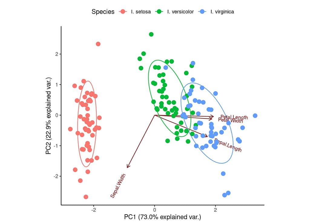
You can see that the first principal component (PC1) explains 73% of the variance in the data. The next principal component (PC2) explains an additional 22.9%. The ellipses represent potential groupings of data based on the principal components. In the example above, we can see that the Iris species form three relatively clear clusters (particularly I. setosa).

We can do something similar in Python:

# Running a principal components analysis (PCA) in Python
#%%
import pandas as pd
# pip install scikit-learn
from sklearn.decomposition import PCA
import matplotlib.pyplot as plt
import seaborn as sns
# Import data
url = "https://raw.githubusercontent.com/lundquist-ecology-lab/biostatistics/main/example_data/iris.csv"
data = pd.read_csv(url)
# Scale data
from sklearn.preprocessing import StandardScaler
scaler = StandardScaler()
data_scaled = scaler.fit_transform(data.iloc[:,[0,3]])
# Perform PCA
pca = PCA(n_components=2)
pca.fit(data_scaled)
# Project data onto first two principal components
data_pca = pca.transform(data_scaled)
# Plot PCA
sns.scatterplot(x=data_pca[:, 0], y=data_pca[:, 1], hue=data['Species'], palette='Set1')
plt.xlabel("First Principal Component")
plt.ylabel("Second Principal Component")
plt.show()
# %%
view raw pca.py hosted with ❤ by GitHub
PCA in Python
PCA of Iris data in Python

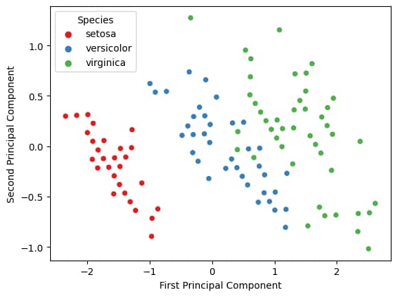
You might notice that there is a lot more information provided in the R plot, but more importantly, the results are the same for both PCAs, regardless of which programming language we use.